The Internet is no different than anything else in life. Mistakes will always happen.
Whether it’s because you forgot to change an old link or something has failed, at some point of time one of your prospective customers is going to land on a 404 error page.
But when the internet hands you lemons and them broken links… all is not lost. You can actually start a meaningful relationship with a potential bounce through a 404 page that is done right.
So how do you do a 404 page right… when it has to tell everyone that they have come to the wrong place?
Let us explore that in greater detail.
Creating a Good 404 Page: 3 Key Elements
A 404 error page is entirely editable and can be customized just like any other page on your site. Keeping that in mind, you need to focus on the following:
- Cognitive Resonance: Your 404 page needs to look the same as the rest of your site. If someone lands on a page that looks nothing like the rest of your brand then they are more likely to close the window and go back to their search engine.
Remember, you need to convey the message that the resource they are looking for is no longer present at the given URL, but at the same time it is essential to give them a sense of cognitive resonance – as in they have not been hacked, or haven’t come to a site that will try to steal their credit card information.
Speak loud and clear that the brand is the right one, just the location is not.
- UX Copy: Just like any other page, the written copy is crucial if you want your visitors to keep exploring your site despite them landing on a 404 error page. UX focus is important. Guide them to explore other options – like your blog or your resource section.
You may link to purchase pages or free trials, but do not make reaching them the goal of the 404 navigation. You can’t macro-convert at this point, and should ideally not try. You may also trigger a chat pop-up with a custom page on your 404 page. This will further encourage visitors to actually ask for the content they were looking for in the first place. Try to locate the link that is broken and fix it! The one thing better than a great 404 page is a working link.
- Humor + Sincerity: Clubbing the two together because they make a great pair to greet someone who was not expecting the issue of not finding their sought content.
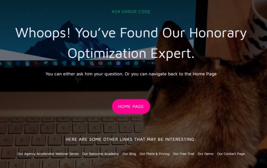
Make them laugh with the visuals, but ensure that your apology comes through with sincerity. The Convert 404 page does a good job of toeing the line.

A Mistake that Leaves a Good Impression
There is no getting away from it. The 404 page will only be seen when a mistake has been made, and this will happen, doesn’t matter how careful you are.
The 404 gives you the opportunity to show some personality and humor. In some cases it can end up being the most memorable of all pages!
Don’t have a working 404 page already? Try this component we’ve made for you.
See the Pen
404 Error Page by Diego Armando Catalan Tandi (@diego-catalan)
on CodePen.
Originally published July 29, 2019 – Updated January 03, 2022
Mobile reading?
Scan this QR code and take this blog with you, wherever you go.
Authors

Arian Azcua
Arian Azcua is the UX Whiz at Convert. He’s passionated about making digital products easy to use and you can also find him wondering for new places to discover on his next venturer trip.
