Let’s start out by asking you a question.
Say you are in an exciting new relationship.
What kind of partner would you prefer. Someone who is taciturn and offers no information about herself? Or someone who makes you feel welcome in their space and lets you take a peek into their world as a promise of things to come?
If you’re like most people, the answer is a no-brainer. It is the latter.
So why do you not hesitate for even a second before throwing your new app users on to a zero state screen that in the words of GoodUI.org is akin to a “cold place without guidance”?
Onboarding a user is in fact being extra careful in the initial phase of the relationship so that it has a solid basis of value and understanding and is conducive to long term longevity. This is why app designers and businesses can’t consider any aspect of the UX to be minor or unimportant – even if it is a zero state screen.
Here are a number of easy to process tips to make sure your Zero State screens come across as inviting and indicative of the pleasant experience the user will have using the application.
Fill it Up
Your potential customer has arrived to the tool from the login page and is greeted by a blank page.
No data.
Zero projects.
Nothing there to pique the curiosity or initiate action.
We certainly don’t want to overwhelm the application user. But we do want them to feel welcome and feel that they are indeed in the right place to begin their journey of benefits realization through your app.
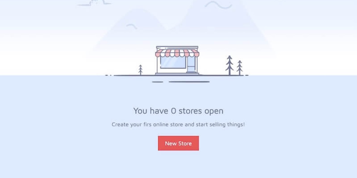
A zero state illustration with minimalistic text is a good choice here. Make sure that the illustration is in alignment with your brand and subtly talks about the first step that the user should take to start utilizing the application.
Be Clear About the First Desired Action
Have you plotted your user’s Hero Arc yet?
If yes, your Zero State Screen is the best place for you to embed a clear, eye-catching call-to-action that will be their call to adventure.
Help them start their journey of exploring the application, and viewing your service/brand as their trusty side-kick.
I have designed this zero state screen template with the best practices baked into it. Use the Codepen widget to access the code and customize it to fit your needs.
See the Pen
Zero State Screen by Diego Armando Catalan Tandi (@diego-catalan)
on CodePen.
It’s always about the first impression….
Chances are you’ve designed an excellent interface for data in your tool. But the important task here is ensuring the user sticks around long enough to take advantage of it.
Putting more thought into the blank slate that can be the difference between a lapsed trial and a happy customer makes good sense.
What do you think? Don’t these screens deserve a little more of your attention?
[PS: Arian Azcua regularly blogs about missed optimization opportunities through overlooked UX elements. He has also written about Search Bars that shouldn’t be shy, and 404 pages that can be a lot more than blandly apologetic.]
